Mimicking Mood and Manner: A conversation with Michael Emmerich, translator of Fukunaga Shin’s “Almost Everything in the World”
2022.01.18
- Michael Emmerich
- Shin Fukunaga
Fukunaga Shin wrote the short story “Almost Everything in the World” (Kono yo no, hotondo subete no koto wo) after the Great East Japan Earthquake in 2011. It was first published online as part of a charity project organized by Waseda Bungaku. It was then collected in the 2012 Waseda Bungaku special issue “Ruptured Fiction(s) of the Earthquake”, before being published in a revised form in 2013 in Fukunaga’s Three Sisters and Their Friends (Sanshimai to sono tomodachi). Michael Emmerich’s English translation of “Almost Everything in the World” was initially published with the Japanese version as a freely distributed PDF. In this interview, Emmerich—who has translated authors from Kawabata Yasunari to Yoshimoto Banana and Furukawa Hideo—discusses the curious position of the story’s narrator and how, as translator, he “played” with type as a way of conveying elements in Fukunaga’s work that might have otherwise been lost.
David Boyd and David Karashima: “Almost Everything in the World” was originally published as part of Waseda Bungaku’s “Japan Earthquake Charity Literature” project in 2011. Could you tell us a little about that project? Did the experience differ from your other translation projects? Do you think it affected how you approached the translation or how it was read?
Michael Emmerich: The “Japan Earthquake Charity Literature” project came together very rapidly in the wake of the Tōhoku earthquake, tsunami, and nuclear disaster. Waseda Bungaku commissioned stories from fifteen writers, which ten translators then translated into English. Both the original Japanese texts and their English-language translations were made available for free as PDFs, with the request that the reader donate to the Red Cross or some other charity working to support those whose lives the triple catastrophe had upended.
Needless to say, the circumstances made translating these stories unlike other translating I have done. So did the knowledge that each translation would be published as a PDF. I had never before translated anything with the expectation that it would circulate only in digital form—though actually I have heard that at some point the stories were collected in a book. Knowing that my translation of “Almost Everything in the World” was going to be published in such a quick and casual manner, without the involvement of a typesetter or book designer, gave me a certain latitude to experiment with the visual appearance of the translation, specifically with the font. I think it might have been hard to persuade an editor to include a text that looks the way “Almost Everything in the World” does between the pages of an otherwise uniformly designed anthology, especially if the publisher hoped to turn a profit.
DB & DK: Translators don’t usually think about fonts, but it’s such an important part of what you’ve done here. How did you arrive at the decision to handle Fukunaga’s story in this way?
ME: The Japanese uses relatively few kanji, most of which figure in the elementary school curriculum. Overall, the text is composed predominantly of hiragana. This, combined with certain word choices and the abundance of commas, gives the impression, right off the bat, that the story is being narrated by—or more precisely that it was written by—a child. Proposing a typeface that mimics a child’s handwriting (or actually two typefaces, since the title is in a different type from the main body of the story) seemed to me like a fairly obvious, straightforward approach: I wanted to represent a visual characteristic of the Japanese text in a visual way. Of course, the choice of font was only one element of my attempt to recreate the “childish” texture of the original Japanese—I worked with spelling, too, and with diction and rhythm. But I thought it was important—or at least interesting—to mimic not just the textual effect, but also the manner in which the effect was achieved. That’s what the font does.
One interesting point about the choice of font, though: while I can’t be sure, I’m fairly certain I must have had it in mind that “Almost Everything in the World” was destined to be circulated digitally, as a PDF file, when I decided to use the faux-handwritten font. I suspect I was taken with that paradox—the notion of a short story referencing the sloppy materiality of a child’s handwriting, when its existence as a text is largely abstracted from the material world. To tell the truth, that contrast in itself strikes me as a pretty interesting translation of the aesthetic of Fukunaga Shin’s fiction.
It is interesting to note, too, that while the choice of font in English does visually echo a visual characteristic of the Japanese, it does so by introducing the suggestion that the story was not just written by a child, but written by hand by a child, which is not part of the original Japanese. Though to some extent, the somewhat over-the-top oral quality of the English produces the opposite effect.
DB & DK: Are you aware of any other stories that play with typeface along similar lines? Did you draw any inspiration from them?
ME: Plenty of texts do interesting things with typefaces, or more broadly with material or visual elements of writing. You could, perhaps, argue that in more or less subtle ways book designers (though not usually authors or translators) are always trying to accomplish something when they choose a particular typeface for a book. I have a copy of Raymond Queneau’s famous Exercises de style that includes “99 exercises de style typographiques de [Robert] Massin,” one of which (“Féminin”) is hand-written in blue ink. I can’t think, though, of any other translations that consciously use a particular typeface as a way to translate some element of the base text. And I wouldn’t say that I was inspired by any of the typographically experimental works I have seen. I was inspired by Fukunaga Shin’s Japanese—just that.
DB & DK: Did you envision the story’s narrator as a child? An adult? Something else?
ME: That’s a tricky question. Thinking back on the story now, I find myself wondering what it might be like to read it—somewhat against the grain, perhaps—as a product of artificial intelligence, or as a work narrated by a young clone like those in Kazuo Ishiguro’s Never Let Me Go. Setting that sort of speculative reading aside, though, it seems to me that while the texture of the prose in Japanese does suggest that the narrator is a child, there is some question as to how much attention we ought to pay to the suggestion itself. In other words, while one might certainly read the story as though it were narrated by a child, you could also read it as an adult’s imitation of a child’s writing, or even as a child’s imitation of an adult imitating a child. The fact that the Japanese can toggle back and forth between hiragana and kanji—including kanji that seem almost ostentatiously difficult (meaning that they would definitely not appear in an elementary-school textbook) in the context of a text that feels, overall, childish—helps create this uncertainty. The English translation is a good deal less flexible in this sense: once I made the decision to go with a childish font, I had to stick with it from start to finish.
DB & DK: Misspellings also play an important role in the English version of this story. What elements in the original does this approach convey?
ME: The easy answer is that the misspellings are just part and parcel of the attempt to mimic the childish mood created by the Japanese text’s heavy reliance on hiragana. Generally speaking, writing that pushes hiragana forward, minimizing the presence of kanji, is one of three things: 1) written by a child; 2) written for a child; or 3) a sign in a train station that tells you the name of the station. Actually, I guess it could also be: 4) a politician’s name on a poster hanging on a wall or in a shop window. In the case of “Almost Everything in the World,” option 1) seems like the most likely. The misspellings are a way of marking this fact, along with the choice of typeface. But while the selection of that typeface was an attempt to mimic the manner in which the Japanese text communicates a “childish” mood (exploiting a visual characteristic to replicate the effect of a visual characteristic), the misspellings were meant to produce something akin to the “childish” mood of the Japanese itself. Misspellings of the sort I sprinkled through the text (somewhat artificially, truth be told: there is an oddly logical inconsistency to them) are tied to particular levels of education, particular grades in elementary school, just like the abundance of hiragana in the Japanese.
Upon reflection, though, I think there is more going on with the misspellings—it’s not just about creating a sense of childishness, or perhaps faux-childishness. The misspellings seem to me, rereading the translation now, to point in a subtle way to the tension between the seemingly oral, spoken quality of the prose, on the one hand, and the fact that it is marked—by the choice of typeface, above all—as having been written down. They create a sense that the text is torn between two contrasting impulses. The inconsistency of the misspellings does that, I think: because while for the most part misspellings remain consistent throughout, there are a few exceptions, some of which are clearly intended to head off the potential that a reader might misunderstand a sentence. We sense, in these careful corrections of the spelling, an adult consciousness, an editorial hand fine-tuning the text as a piece of writing. The same is true, too, of other subtle deformations that we see in the written forms of the words: the use of bold type for a loud banging, for instance, followed by the use of a smaller type for a quiet bang.
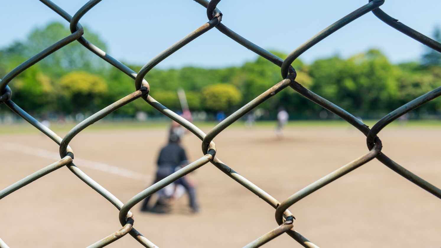
DB & DK: In the baseball scene, “kanpai” (written out in hiragana) takes on two different meanings. In English, you’ve handled this with a rhyme [“sunk” and “drunk”]. Could you walk us through that choice?
ME: In the Japanese, the first kanpai means “total defeat,” while the second means “drink up” or “cheers!” In the English translation, one of the team members calls out, “Forget this game. It’s no good! We’re sunk!” In response, a red-faced man, presumably the coach, yells, “I’m not sunk! I’m drunk!” The Japanese offers us a perfect homonym; the English gets as close as it can, but not all the way. The important point, though, is that just as the choice of that handwriting-like typeface was meant to replicate the visual manner in which the Japanese text was communicating “childishness,” so too the use of the rhyme (or partial homonym) is meant to replicate the aural manner in which the Japanese text communicates the coach’s utter lack of interest in the game, or in the team he coaches.
Michael Emmerich is Professor of Japanese in the Department of Asian Languages and Cultures at the University of California, Los Angeles, and Tadashi Yanai Professor of Japanese Literature. He is the author of The Tale of Genji: Translation, Canonization, and World Literature (Columbia University Press, 2013), and has translated over a dozen book-length works by authors ranging from the Nobel Prize laureate Kawabata Yasunari to immensely popular contemporary writers like Yoshimoto Banana and Takahashi Gen’ichirō.
David Boyd is Assistant Professor of Japanese at the University of North Carolina at Charlotte. He has translated fiction by Hiroko Oyamada and Mieko Kawakami, among others. His translation of Hideo Furukawa’s Slow Boat won the 2017/2018 Japan-U.S. Friendship Commission (JUSFC) Prize for the Translation of Japanese Literature.
David Karashima is Associate Professor of Creative Writing at the School of International Liberal Studies, Waseda University. He has translated the works of a range of contemporary Japanese writers including Hitomi Kanehara, Shinji Ishii and Hisaki Matsuura. His nonfiction book Who We’re Reading When We’re Reading Murakami was published by Soft Skull Press in 2020.
Related
-

The Invisible Onlooker: A conversation with Lucy North, translator of Natsuko Imamura’s The Woman in the Purple Skirt
2022.03.16
- Lucy North
- Natsuko Imamura
-

Wrestling with Humourous Beasts: A conversation with Polly Barton, translator of Aoko Matsuda’s Where the Wild Ladies Are
2022.01.21
- Aoko Matsuda
- Polly Barton
-
Some Prefer Footnotes: A conversation with Margaret Mitsutani about her translation of Yoko Tawada’s The Emissary
2021.09.10
- Margaret Mitsutani
- Yoko Tawada
-

Living in a Storied Neighborhood: A conversation with Ted Goossen about his translation of Hiromi Kawakami’s People from My Neighborhood
2021.09.10
- Hiromi Kawakami
- Ted Goossen
-
Merely a Beautiful Dream? A conversation with Hitomi Yoshio, translator of Mieko Kawakami’s “Dreams of Love, Etc.”
2021.09.03
- Hitomi Yoshio
- Mieko Kawakami