Design and life are interesting because they are "difficult to understand" and "do not work"
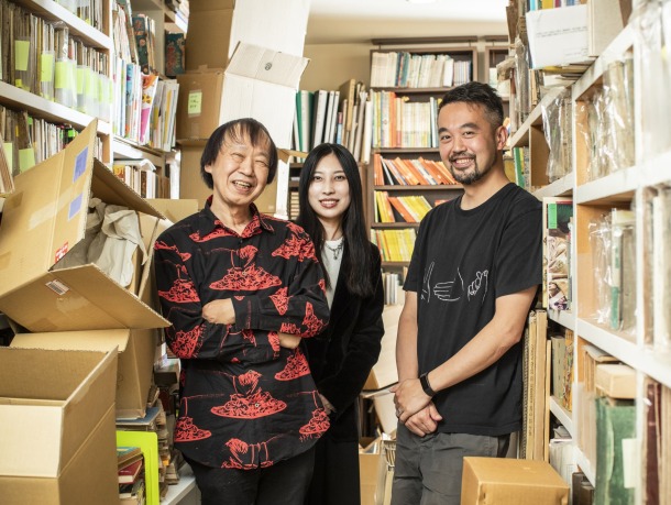
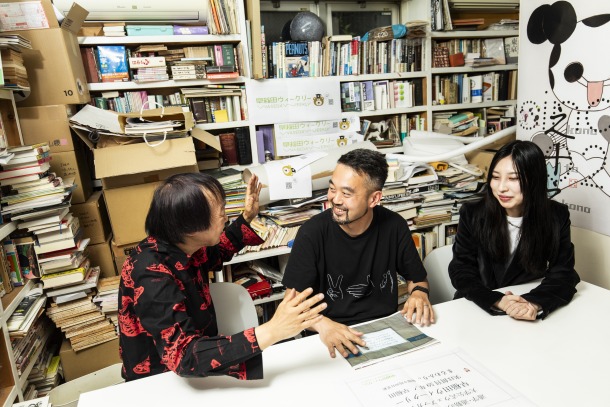
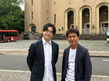
(From the left) Sobue, Shima, and Dominique, surrounded by cardboard boxes that "used" to hold newly arrived books (laughs) at Sobue's design studio, Cozfish.
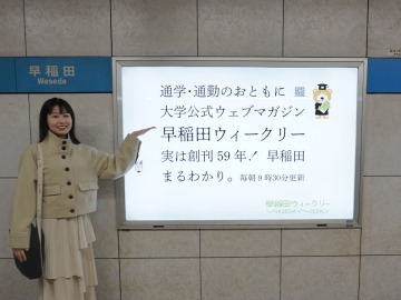
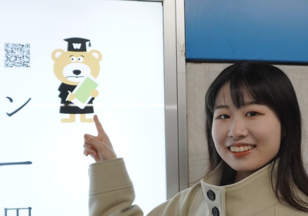
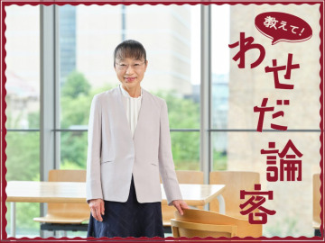
An advertisement on the platform for the Iidabashi direction at Waseda Station. SJC student staff member Tanabe (4th year, School of Culture, Media and Society) poses for a commemorative photo.
In the spring of 2024, an advertisement for Waseda Weekly was posted on the platform at Waseda Station on the Tokyo Metro Tozai Line. The design was done by Shin Sobue, a master of design who continues to bring to the world the fantastical and unconventional cover designs for novels, manga, and other works, including Soseki Natsume's Kokoro and Momoko Sakura's works. The design is surprisingly simple, with strange balances lurking everywhere.
This time, we planned a special conversation to ask Sobue about the mystery of the strangeness of the Waseda Weekly advertisement and the thoughts that went into the design. The person speaking Professor Dominique Chen (Faculty of Letters, Arts and Sciences), who has long admired Sobue and asked him to design an exhibition that he directed. In addition, we were joined by designer Karen Shima, who worked with Sobue on the new logo design for the Weekly.
These true free spirits, experts who find the fun in "difficulty to understand" and "failure," talk about everything from advertisements in Waseda Weekly to the secrets to living freely... Let's begin this free-flowing conversation.
It's funny because the design makes you want to point it out!
Dominique: I first learned about Sobue-san when I was about 9 years old and read Sensha Yoshida's manga "Densha Otoko". I remember being excited as a child and thinking, "What kind of crazy book design is this?" So in 2020, I was over the moon when Sobue-san's agency Cozfish agreed to do the graphic design for the "Translations" exhibition that I directed at 21_21 DESIGN SIGHT (laughs). So when I heard that Sobue-san had designed the train station advertisements for Waseda Weekly, I was both happy and surprised. Why did he agree to do it?
Sobue: I always have a strong desire to do things I've never done before. First of all, it was my first time designing a media created by a university. I've designed station advertisements a few times, but those were for exhibitions I was involved in. The Waseda Weekly job didn't have that kind of flow, and I was suddenly asked to just do an advertisement to be displayed on the platform at Waseda Station. I thought the suddenness of it was interesting.
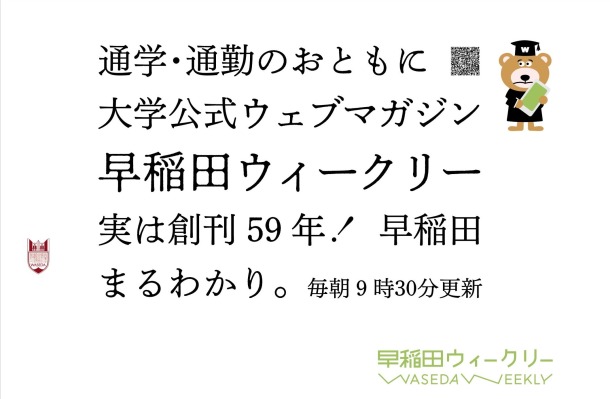
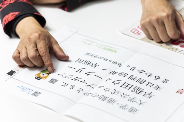
Station advertisement for "Waseda Weekly"
Dominique: When I first saw the ad, I thought, "Oh, it's mainly text." University-related media often uses a lot of photos of campuses and students, so it's refreshing that there are no photos of that at all in this ad.
Sobue: Yes, I wanted people to read the text first. To achieve this, I didn't use any photos, just illustrations and emblems of WASEDA BEAR, and I kept the text to a minimum, including only the things I really wanted to convey.
Dominique: If you look closely, you'll notice that the font for the "Waseda Weekly" in the middle is different. At first glance, it looks like a normal Mincho font, but the edges of the letters look blurred. Is this intentional?
Sobue: Look more closely. In fact, each character is different. Hiragana and katakana are blended, but kanji are not. By deliberately not standardizing the characters, it creates an opportunity to ask "why?" And then, you know, conversations are born from there.
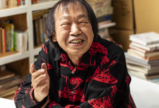
Shin Sobue was born in Aichi Prefecture. After dropping out of the Graphic Design Department at Tama Art University, he worked as a graphic designer and art director while also currently representing cozfish. He is at the forefront of book design in Japan, working across a wide range of genres. He has also demonstrated his talent in exhibition graphics and merchandise design for events such as the Snoopy Museum Tokyo and the Miffy Exhibition. His past work has been compiled into the book " Shin Soubue + cozfish" (PIE BOOKS). Many students aspiring to become editors say, "It's my dream to work with Sobue-san one day."
Dominique: Oh, that's true! I'm happy that I'm taking design lessons from Sobue-san (laughs). Also, although it has nothing to do with design, I was surprised to see in the advertisement that Waseda Weekly was first published 59 years ago.
Sobue: It's an interesting number. You don't see that in other advertisements very often (laughs). If they were going to advertise for the first time, they should have waited another year and made it "60 years."
When it was first published, Waseda Weekly was a paper newspaper published once a week. It became a web magazine eight years ago, and is updated every weekday during the school term. So it's a "daily" magazine, isn't it? And a 59-year-old "web magazine" is from a time before the Internet. Even though it's a university publication, it's full of things to criticize. When you find things like that, you want to talk to someone.
Dominique: That being said, we don't go into detail about the points of criticism in the advertisement. We leave it up to the viewer to interpret them as they are.
Sobue: I don't like adding just-in-case explanations and annotations to avoid complaints. That makes the ad too intrusive and unpopular.
Rather than that, isn't it more interesting to have what you want to communicate be interpreted differently by different people? Whether or not you can get your point across well or not means that you are communicating with someone, so it's better to enjoy that "not going well"!
Dominique: I feel the same way when I teach at a university. I've been Faculty for seven years now, but I don't like the words "Professor" or "Faculty." I feel like I have to tell people the right answer, and it's difficult for me. On the other hand, I find it interesting when my assumptions are misinterpreted in a good way. I'm happier when they go way beyond my imagination (laughs).
Sobue: It's the same for designers. I think that in life, too, it's important to have the ability to find enjoyment in things that don't go well.
Dominique: Another interesting thing is the "Waseda Weekly" logo in the lower right corner. The "W" shapes are uneven and point in completely different directions, which is very Waseda-like and nice (laughs).
New logo and Weekly Waseda Bear. The smartphone screen is light green, the Weekly theme color.
Sobue: That's right, we also made a new logo and fine-tuned the WASEDA BEAR to make it a weekly design. The designer, Shima, tried out various designs for the logo, and this orientation of the "W" turned out to be the best. I'm not from Waseda, but isn't Waseda a liberal university? All the active students are doing what they like. I think that's reflected in the two "W" that seem so different from one another.
Shima: I also graduated from a different university, but I had the impression that my classmates who went on to university were cheerful and enjoying campus life. That's why I tried to move the "W" character, which is the focal point of the logo, freely and freely. I also intentionally changed the width of the first W and the second W.
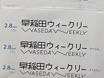
Shima's prototype logo. If you look closely, you can see that the thickness of the letters is slightly different.
Dominique: I see. It doesn't seem like there's just one right answer, but rather it feels like a bunch of different people are gathering in the same place, and I really like that. How did you change Waseda Bear?
Sobue: Originally, he was a sturdy, manly character. He would sometimes carry a cane, and look like a teacher. I thought it would be better if the Weekly's WASEDA BEAR was more approachable.

The original WASEDA BEAR was born in 2000.
Shima: So, while being careful not to change the impression too much, I used delicious colors like cookies, had him hold a smartphone, and made him look like a student. I made his eyebrows look a little timid. His eyes were turned to the side, and his mouth looked troubled.
Sobue: It's like transforming from a Showa-era bear into a Reiwa-era bear. However, that makes it easier to get closer to the bear.
Dominique: I feel more attachment and affinity with the bear that seems a little troubled and weak. And the emblem on the left. It's modest in size and doesn't seem to be trying to make a statement, and it's in a strange position, like it's floating in the air, and it really catches my attention.
Sobue: Actually, the Waseda Weekly editorial office has consulted us many times about the emblem, saying, "It's in such a strange position that it would be better to move it to a more obvious place, like the center or the bottom left." But the bottom left or center are the places that seem the most conspicuous, but are the least likely to catch people's attention. Everyone should think more about the danger of placing it in the center as a matter of course (laughs).
That said, it wasn't just placed randomly, but the vertical position is between the last two lines, so there is a logic to the placement. But it's not a typical logic. This creates the joy of thinking in the viewer. Like Dominique, it makes you wonder, "Why is this here?" and "Why is it so small?" It's an advertisement like haiku (はいく) that creates the joy of thinking and becomes more interesting the more you look at it. I hope you'll take a look at it on your way to school every day.
This university is full of free-spirited and relaxed people. Even if you try to teach them, they just go their own way and do things on their own. I think that this advertisement for Waseda Weekly was able to capture the wonderfulness of Waseda University.
Individuality is not something you "create" but something you "allow"
Dominique: When I encountered Sobue-san's book designs as a child, I learned "So this is what freedom is!" I would like to hear about the secret to living a free and relaxed life like Sobue-san. Waseda has a diverse student culture, and I feel that many students end up struggling by trying too hard to express their individuality.
Sobue: Sometimes in interviews I'm asked, "Why did you choose such a unique design?" But I don't think about expressing myself or trying to convey something in a forced way.
What's important to me is to be "enchanted." That's the time when I lose myself and become immersed in something. That's when interesting things I never expected come out of it. So what I do is design that makes I forget myself, rather than expressing myself.
Dominique: "Forgetting myself" is important, isn't it? But I think careful observation is necessary to do that. In my seminar, we are now all doing fixed point observations of our daily lives. We try to find our own senses and ways of looking at things by taking pictures and writing about things that might soon be forgotten, like a random view that moves us or a pattern on a desk that we like. In other words, we are collecting evidence that we are who we are. By doing this, we feel like the contours of ourselves and the world around us begin to emerge on their own.
Dominique Chen Professor Faculty of Letters, Arts and Sciences Waseda University. He holds a PhD in Interdisciplinary Information Studies. He runs a fermentation media research seminar in School of Culture, Media and Society Media and Society, where he has developed the talking rice bran bed Nukabot and held design workshops based on the concept of fermentation, while researching desirable relationships between technology, humans, and natural entities. In 2020, he served as exhibition director for the 21_21 DESIGN SIGHT exhibition "Translations - Let's understand our incomprehension," and commissioned cozfish to handle the graphic design. He has written many books, including "Words that Create the Future: Connecting the Incomprehension" (Shinchosha).
Sobue: Things that seem unnecessary at the time turn out to be incredibly great and precious when I look back on them. When I realize this, I come to understand myself and the world better. But I can't control this discovery. That's why it's so satisfying.
Dominique: I see. I call the process of "fermentation" something that you can't control completely but that changes as you are involved in it. We even named our seminar "Fermentation Media Research Seminar" (laughs). The reason is that discovering myself is similar to making pickles in a rice bran bed. The taste of the pickles changes depending on the type of vegetables I put in, and also on where I place the rice bran bed. If I don't take care of it, it will get moldy, and if I take good care of it, it will produce a nice aroma, but that doesn't mean I can completely control the taste.
I think the process of discovering own individuality is similar to the feeling of putting vegetables into a rice bran mash and watching how they ferment and what flavor they produce.
Sobue: Yes, it's like gazing at something. In my words, it's a state of "losing myself and becoming entranced." But no matter how much I forget myself, there are some habits that remain. I want to forget them but they remain, I want to lose them but they remain. But the things that I can somehow forgive become my individuality.
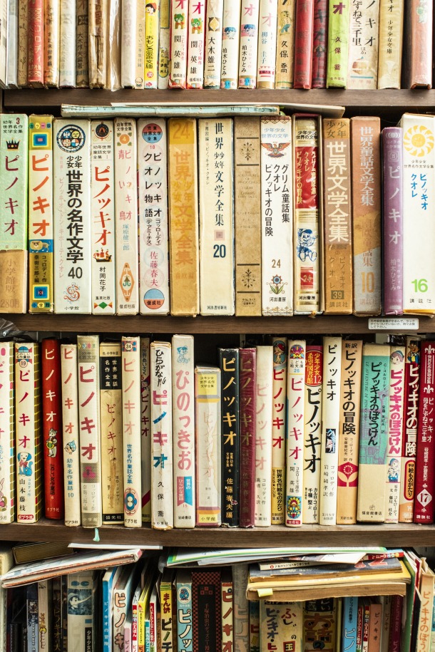
One of the things that Sobue finds "losing his senses" is "things expressed in words." He has collected and compared books with the same title, starting with "Botchan," "Pinocchio" and "Nansō Satomi Hakkenden." The photo shows a bookshelf filled with copies of "Pinocchio" from all over the world. He reads while paying attention not only to the changes in the words, pictures and visual expressions, but also to how the story changes from book to book.
Dominique: Ah, "I can forgive" is a good word. If I only divide things into clear "good" and "bad", I end up with a pre-determined harmony. But if I can forgive things that don't go well, it gives my heart more depth, or I get the image that my capacity has increased.
Sobue: Before I know it, I start to feel that something I thought was bad is my own personality. I think being able to enjoy such situations is one of the joys of living. I hope students will treasure the fun that comes from people in their 20s losing themselves and becoming passionate about something.
Interview and text: Masaki Ueda (1st year Graduate School of Law)
Photo by Kota Nunokawa
![[Save version] Map of the four main campuses](https://www.waseda.jp/inst/weekly/assets/uploads/2026/06/110d605cfac40346aad1d2df464a6586-940x705-1-1-610x457.jpg)
